You may not be aware of it, but many paint and pigment companies choose colors that they think will be hot in the coming year. Shades of green seem to be an overwhelming favorite for 2022, with almost every company choosing some green hue as either their top pick, or part of their overall range of choices. In fact, green is so well-represented this year that there’s really only one company that seems to be bucking the green trend entirely, but it’s a big one.
Pantone Color Institute, the company that actually manages color standards, broke from the pack with a significantly different choice for color of the year. Before we get to what that choice actually is, though, let’s take a moment to consider the rest of the color of the year choices from other companies. This will help you to appreciate just how big of a break with industry trends the Pantone choice really is.
Something in a Shade of Green
Usually, different paint companies offer up a pretty wide range of shades when it comes to choosing color of the year options. For 2022, however, there’s a pretty rare consensus among most of the big players in the industry that neutral shades of green are where it’s at. This isn’t just a couple of companies, either; take a look at some of these selections:
- Benjamin Moore: October Mist, a light green with touches of grey and yellow
- Sherwin-Williams: Evergreen Fog, a soft green close to olive
- PPG: Olive Sprig, another soft green with a hint of yellow
- Behr: Breezeway, a soft, light green
- Dutch Boy: Cypress Garden, a somewhat stronger green
- Glidden: Guacamole, another strong green with a hint of yellow undertone
Other popular companies such as Valspar and Dunn-Edwards offered up multiple color of the year choices, and green shades were included in the offerings of both.
Pantone’s Color of the Year
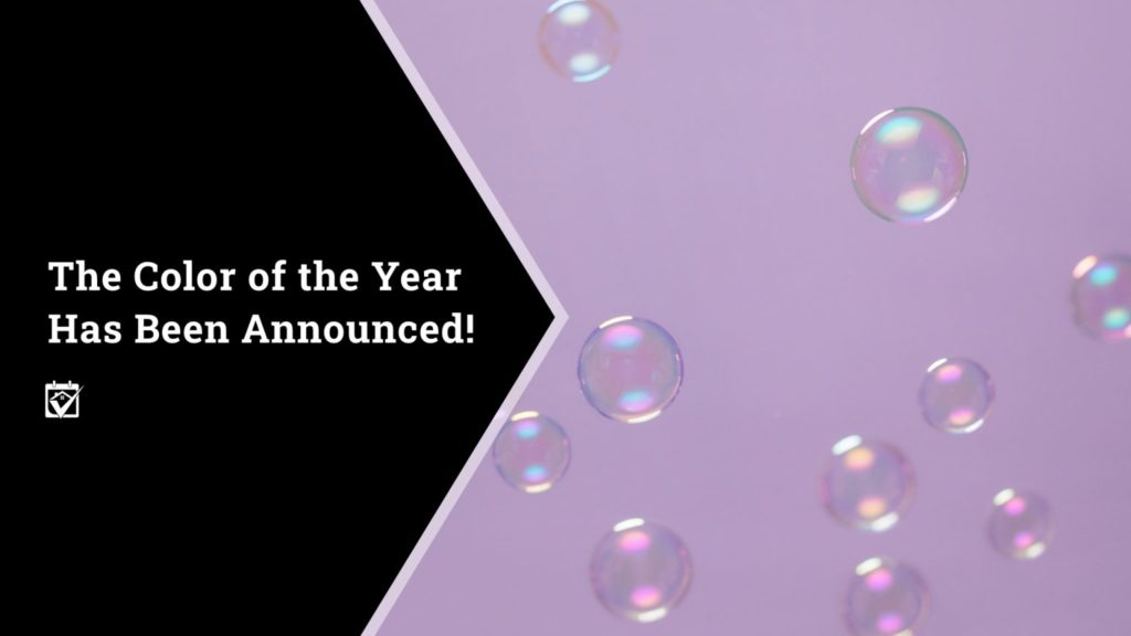
With green being so well represented by other companies, you might expect Pantone to have chosen something similar. That’s not the case, however, as Pantone’s selection for 2022 is a periwinkle blue offering known as Very Peri. It’s a pretty well-rounded periwinkle shade, falling in between blue and purple without being overwhelmingly either. Looking at it, it’s pretty easy to see why Pantone believes the color is really going to take off in the coming months.
According to Pantone, the color was chosen because of how well it reflects the changes that the world is currently going through. Pantone Executive Director Leatrice Eiseman stated that the classic blue color with violet-red undertones “displays a spritely, joyous attitude and dynamic presence that encourages courageous creativity and imaginative expression.” It’s a cool, calming color and could see use in just about any room in the home as well as the exterior.
Using These Choices in Your Home
Whether you’re going with one of the green options offered up by the paint companies or Pantone’s choice of Very Peri, there are a number of ways that you can use these colors in your home. They can be used as accents in bedrooms, living rooms, or kitchens, as door and shutter colors to accent your home, or even coatings for islands or other large wooden furniture pieces to really make them pop. They may need other colors or some strong woodgrains to add some warmth or contrast, but if you put in the work to find the right shades, then you’ll have color combos that will leave people talking.
If you have questions you may contact me to see how I can help you.
Michelle Lohman, Associate Broker
Realty One Group

All content provided on this blog is for informational purposes only. The owner of this blog makes no representations as to the accuracy or completeness of any information on this site or found by following any link on this site. The owner will not be liable for any errors or omissions in this information nor for the availability of this information. The owner will not be liable for any losses, injuries, or damages from the display or use of this information.

Leave a Reply
You must be logged in to post a comment.